Archive for the ‘Activities-6696’ Category

Kinestasis Film

Thursday, April 11th, 2024

Background

At NYU Mitchell Stephens and his colleagues created a movement to explore the impact of the presentation of a montage of images in rapid fashion. We began to understand that one could recognize (and sometimes recall) images that were displayed for as little as a third of a second. Several experimental movies were produced an presented at various arts shows throughout New York at the time.

From Stephens’ book:
The Russians borrowed a word to express the ability to record movements in the most complex combinations to place points wherever they wanted to create a fresh perception of the world. This term, which would have so much significance for film, entered the art world primarily through photography… the essential experiment in film montage was conducted by Lev Kuleshov, an influential film instructor… the point of what became known as the Kuleshov effect is that meaning of a shot is dependent upon the shots that surround it. The point of montage is that new meanings can be created through the juxtaposition of different shots.

These experimental movies became to be known as kinestasis film.

Do This
dothis

Watch each of the movies and answer the questions that follow for each. Confirm your participation in this activity by posting a short reflection and reaction in the Drop Box on Canvas.

While the movement took hold in the late nineties (most likely due to the invention of non-linear video editing software such as Final Cut and Premier), the popularity of kinestasis goes back to the 1970s when a little known movie producer got a shot at showing his kinestasis film on prime time television. Chuck Braverman produced an exciting masterpiece that traces the history of the United States in four minutes through a fast cut collage of approximately 1,300 images presented in about 4 minutes. It is accompanied by a coordinated drum solo. To put this in perspective, it was cut entirely by hand using a razor to assemble the analog images on to a single film strip. It was first shown in live TV in the early 1970s during an episode of the Smothers Brothers Comedy Hour Television Show (a popular show that appeared on Sunday nights on CBS during prime time).

American Time Capsule - mp4 Version


Remember, there are approximately 1,300 images displayed whose length ranged from a quarter to a thirds of a second. See how many questions you can answer correctly:

Question #1

What was the main context/POV of the video?

While we do not know for sure but this movie had an anti-war undertone (which was one of the attractions to it in the part of the Smothers Brothers show. As the Vietnam war wore on the show became more and more political (as well as other popular shows on CBS at the time.. M.A.S.H. being the most popular)). While not the entire plot, the movie does trace much the history of the United States through the eyes of the various wars the conquest of the West, WWI and II, etc.).

Incorrect


Question #2

What was the major color/scheme that carried through the video

Much of the color overtone was red or reddish. A sign of danger and leads one to believe in the possible anti-war undertone.

Incorrect


Question #3

What did the sign say that Harry Truman held up towards the end of the movie?

OK, we put in a distractor.. it wasn't a sign but a newspaper headline, a VERY famous newspaper that announced that Dewey had won the election over Truman, when in fact it was premature. We did not want to give it all away in the question... we are testing your 'fast-seeing' ability. When we ran this in a recent study with middle school children (most of whom did not know who Truman was or the context of the newspaper headline), most of them got it.

Incorrect


Question #4

What was the famous cartoon icon that showed up near the end?

Again a test of your fast seeing... it only appeared for 1/3 of a second... Mickey of course.

Incorrect


Question #5

Which president was shown at the end of the movie?

This should have been an easy one... Nixon... the movie ended there as the then current event... and should have been easy because of the length of time his picture was on the screen... the idea behind kinestasis is that once, you get used to fast seeing, when you view something in regular time (maybe a second), it seems like slow motion...

Incorrect


Sidebar

Jeff Scher is a colleague who I met through my acquaintance with Stephens. He experimented greatly with kinestasis. Through the magic of the Internet I met Jeff and we discussed his film on several occasions. He knew it was experimental but it does produce the exact effect we look for. See how many stories you can identify in this short film. There are several others but this one was the most fun and less esoteric.


Milk of Anmesia - mp4 Version


See how many questions you can answer correctly:
Question #1

What were all the images that formed the background of the film?

Not expecting to know this but asking you to make a guess... they were still images of items that formed the backdrop from the producer's life... signs, newspapers, cigarette packages, street scenes, etc. The title of the film was your hint.

Incorrect


Question #2

Was this movie shot as a movie but a quickly viewed series of still shots that appeared to be moving because of the speed they were presented?

OK, an easy one: but we wanted to make the point of kinestasis.. that when images are placed next to one another they appear to be movie and one continuum.. the science behind this is real and what it says is that about 1/3 of a second is all it takes for this phenomenon to occur. This translates to the framing rate for moving images in film... 15 frames per second for black and white... or about 24 for color (it takes us longer to process color). There is a lot of theory behind of all of this and explains the science behind television and movie making but that is the subject of another course (EME 6209).

Incorrect


Question #3

What was the metaphor of the cow?

Milk=Cow? a play on words?? milk of magnesia vs milk of amnesia? Memories of the producer's life... things remembered and others that have been long forgotten...

Incorrect


Question #4

Name some of the repeated images/scenes

This is not intended to be a complete list but swimming and diving, tight rope, pets, the cow, scenes from what we can only guess is from his past. Repetition is a fact of a child's life... I talked with Jeff about this and this is mostly what he said... I did not wish to make him feel bad by asking too much, as if I 'didn't get it" insofar as what he was trying to say. Each time I view this video I get more out of it.

Incorrect


Sidebar

Jeff Wescott was a student who took a film/video class from me. In that class we experimented with kinestasis but instead of making it a single concept film, students were asked to insert the montages at appropriate moments in the film to make a point. You will notice how this montage moves more quickly in the form of a climax and how the final moments are made more dramatic at the end mostly because your eyes get used to the fast pace and once it slows down to normal speed it actually seems to be slow motion. An interesting technique.


America Westcott - mp4 Version


See how many questions you can answer correctly:

Question #1

Whose presidency did this mostly cover?

Another easy one... GW Bush

Incorrect


Question #2

When you first started viewing this video did you get the sense of where it was going and possibly ending up?

The overtone was again about war and how big business seemed to direct our entire lives. The music and pictures seemed to be driving the point of where this was going.

Incorrect


Question #3

True or False: The newspaper montage was made up of many repeats of the same newspaper filmed many times over (similar to the Milk of Amnesia film)?

Correct
Incorrect


Question #4

What major visual technique did the producer utilize to increase the emotion and build to a crescendo/climax?

Speed... the video also did an excellent job of timing to the music, which seemed to set the tone... but the images at the end and the speed they were displayed was a fabulous example of the power of kinestasis.. even at the end when the lights went out in the stadium.. played at regular speed, seemed like slow motion.. making a dramatic point.

Incorrect

Activity: Matching Familiar Figures Test (MFFT20)

Wednesday, April 3rd, 2024

According to Wikipedia:

“cognitive style or “thinking style” is a term used in cognitive psychology to describe the way individuals think, perceive and remember information, or their preferred approach to using such information to solve problems. Cognitive style differs from cognitive ability (or level), the latter being measured by aptitude tests or so-called intelligence tests. Controversy exists over the exact meaning of the term cognitive style and also as to whether it is a single or multiple dimension of human personality. However, it remains a key concept in the areas of education and management. If a pupil has a similar cognitive style to his/her teacher, the chances that the pupil will have a more positive learning experience is said to be improved. Likewise, team members with similar cognitive styles will probably feel more positive about their participation in the team. While the matching of cognitive styles may make participants feel more comfortable when working with one another, this alone cannot guarantee the success of the outcome”.

Just to show you how this all works, you are going to take the Matching Familiar Figures Test (MFFT-20) So as not to spoil their impact, we will review the significance of this instrument after you take it. So, without much further explanation, here is how this assignment is going to work.

Do This:

You are being asked to take the MFFT-20 as a class assignment. The problem for us is that the test is run as an executable file that we have to download to our PC computers. Unfortunately, this program only works on a PC at this point. Hopefully, you can get access to a PC (not a MAC).
Downloading executable files is problematic due to all the spammers out there trying to access you computers. So, we have to fool the system into allowing you to download the file. I have renamed the file with a phony “.fil” extension to allow it to be downloaded. Once you get the file you can rename it by changing the extension from ‘.fil’ to ‘.exe’. Your computer will object to all of this and throw up lots of warnings that you can safely override. (Usually a prompt will appear saying something like “Read for More Information’ or ‘Advanced’ etc.

Follow these steps.

  • Click here to download the kagancog.fil file.
    Depending on your settings it will be downloaded to your download folder or to your Desktop. You may leave the file wherever it lands.
  • Open the downloaded file’s location (usually if you are using Chrome there is a small circle icon at the top right). Right click that icon and answer the prompt that say show in location.As noted, the file will be named kagancoc.fil.
  • Rename the file kagancog.exe. You will probably get a warning message. Ok to ignore it is safe.
  • It is ok to run this file, even if Windows objects. You may get an error or warning. It is Ok to ignore that warning and Rename and then open the program file using the .exe extension anyway.
  • It will open a file with this icon:


    • Follow the instructions contained in the program:
      1. Open the file. Use your last name to log in.
      2. The instructions for the program are found with in the file.
      3. You are to match the picture in the top left of each screen with an exact likeness from the six choices. Make your choices. The system will tell you if you are correct or not each time. If you are correct, you will be allowed to proceed to the next picture (20 pictures in all). If not, the it will loop back the same question until you get it correct.
    • As the name MFFT20 implies, there are twenty sets (plus two easy example sets for practice).
    • When you are completed, you may close the program.
    • In the same folder you ran the program (either your desktop or downloads) will be a folder called ‘prefs’:
      Inside that folder is a file called lastname.txt


Upload the lastname.txt file to the drop box in Canvas. I will post points for your completing this activity. In a later class we will go over the results as a group. This activity is not graded but points will be awarded for completion.

Activity: Group Embedded Figures Test {GEFT}

Tuesday, April 2nd, 2024
Introduction

The Group Embedded Figures Test (GEFT) was developed for research into cognitive functioning, but it has become a recognized tool for exploring analytical ability, social behavior, body concept, preferred defense mechanism and problem solving style as well as other areas.

We have created some downloadable pdf files for you to print and take the test. For now all you need to do is take the test. Please keep it in a safe place. At the end of the term we will send you a scoring key and discuss what it means as a part of our assessment lesson. The documents are scans of some paperwork that has been around for quite a while. While I apologize for the poor resolution I think they still serve the purpose. The idea is for you to to find the “basic forms” within the more complex items on the sheets. I know we have your curiosity up on this one and the one we did last cycle but it will all make more sense as we complete the course.

Do This
dothis

Below are links to each section of the test. The instructions include the simple/basic forms you are to locate within the more complex diagrams. Download the test sections to take the test. You may do the same for the keys, instructions, and scoring sheets but to have to. The basic forms you need to find are noted in each item. Draw your response on each item using pencil to identify the simple forms indicated. Confirm your participation via the survey found under the assignments tab for this cycle. This is not a timed test.


Here are the instructions with the Simple/Basic Forms Sheet

Click to download Section 1 (Practice Test)


Take the practice test, then look at the answer key to check your answers. The intent is to show you how to take the test, not to indicate or predict how you will do on the remaining sections.

Here is the answer key for section 1


Sections 2 and 3 are the actual test. When you are ready take them (they are supposed to be timed but we will not need to do that for our purposes).
 

Click to download Section 2


Click to download Section 3


You can score your your own test now. In a later class session we will review the results, as well as review the documentation from the Kagan test. After looking this over and scoring yourself save the results. Go back to Canvas and confirm your participation

Download Link: https://emeclasses.org/wp-content/uploads/2018/03/geft-key-section2.pdf

Here is the answer key for section 2

Download Link: https://emeclasses.org/wp-content/uploads/2018/03/geft-key-section3.pdf

Here is the answer key for section 3

MFFT & GEFT Results

Sunday, March 31st, 2024
For this activity please do the Following
dothis

The goal of this activity is for you to score yourself on the GEFT using the keys provided below and place yourself in one of the grids below based on the results sent to you for the MFFT-20. For the Matching Familiar Figures Test, we scored it because your final result depends on what the others did in your class.

In summary, this activity has two parts:

  1. Score yourself on the GEFT and review your results from the MFFT-20.
  2. Then based on the scores and readings, evaluate your scores to decide which of the ecosystems we have discussed this term best applies / would be most useful to you as a student for a given learning situation.

The idea is for you to see how cognitive tempo/style can be a determinant with regards to the best media to use in a class or a course you are asked to design. This exercise correlates to the ‘A’ in the ADDIE model (analyze the learner) in instructional design. I submit that these kinds of tests are more accurate measurements than self-scored instruments because, as we have found out, people do not always learn best from their preferred learning styles. The joke I sometimes use is that I am a visually impaired visual learner. I am only half kidding… sometimes folks have a preferred style but are not very good at using it to learn… we will discuss this in our Synchronous meeting.

Post your reflection about your thoughts on the MFFT-20 and GEFT in the drop box on Canvas.

Background Information about the Tests

MFFT-20

The version of the Multiple Familiar Figures Test (MFFT-20) that we are using was originally developed by Cairns and Cammock back in 1984 at the University of Northern Ireland. The sample was middle school students (ages 12-14). This seems to be the most commonly used samples in the previous studies. It is thought that as a person ages, his or her tempo will gravitate towards being more reflective. The instrument Cairns and Cammock used was the original MFFT developed by Jerome Kagan in the 1960s. These instruments were subsequently evaluated for validity and reliability and adapted over time by several individuals (Arizmendi, Paulsen, & Domino, 1981; Block et al., 1974; Watkins, Lee, & Erlich, 1978) to determine whether they actually measured impulsive-reflective tendencies in individuals.

The original format of the MFFT-20 was a paper version in which participants made their choices by selecting the matching figure from a set of six distracters by pointing. The investigator was responsible for manually keeping track of the number of choices made by the participant and utilized an assistant who used a stopwatch to time their latency/delay in making their first response.

For the this automated version I scanned into a computer the paper copies of the figures and alternative choices and imported them into a computer program that was the precursor to Flash (Macromedia Director). The program presents the pictures and their alternatives on a single screen and allows the participant to click on their selection to indicate their response. The computer program automatically keeps track of the total number of choices made before the correct one is selected and the amount of time it takes to make the first pick for each of the item sets.

Recall that you were presented with 20 sample pictures of familiar items and then were asked to identify which one of six alternatives was identical to the sample. If you made an incorrect choice you were subsequently asked by the computer to retry until you made a correct response.

The dividing line between impulsive and reflective quadrants was the median score for latency for this administration of the test (i.e., the average amount of time you delayed until each of you all made your first selections for all 20 pictures) and the median number of errors (also averaged for each participant) The medians were place along horizontal and vertical axes. Based on how each of you fared as compared to the median split lines, you were placed into one of four quadrants made up by the two intersecting axes.

If it was determined that you made relatively quick but inaccurate decisions you were place in the quadrant labeled ‘impulsive’ (Q1). If you were more deliberate (i.e., you showed an increased latency until your first response) and made fewer errors than the calculated median you were determined to be ‘reflective’ (Q2). Those of you who were found to be fast-accurate (i.e., faster and more accurate than the calculated medians) or slow-inaccurate were placed in two other cells (Q3 and Q4 respectively). The ones historically utilized in the administrations of the test are the former(i.e., the impulsive and reflective) quadrants. It is not that the other quadrants do not have matter but comparisons in the research only dealt with the impact of those placed in the first two categories.

Impulsive:
Q-1
Slow –Inaccurate:
Q-2
Fast-Accurate:
Q-3
Reflective:
Q-4

Notes

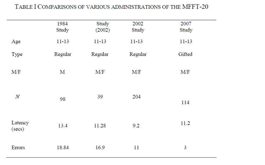
    • We will look at our results as well and those from previous administrations of the test during our next Synchronous class Session. In the meantime you will be sent your individual scores via Canvas emails, not that it will mean that much until we meet. Here is a sampling of the scoring that will be presented. The studies from 2002 onward are mine.
  • Second, the break points for each quadrant are different for each administration of the test. We will revel those two levels (for speed and accuracy) during our meeting.

According to the literature, (Berry, 1991; Green, 1985) the MFFT (and its various derivations) has been one of the most commonly used and more accurate means to test for cognitive style and to show how individuals perceive and process visual patterns. The MFFT-20 has been found to be the most valid and reliable measurement over time.

But the MFFT has also been the subject to several attempts to refute it as a valid diagnostic test (Salkind & Wright, 1977; Watkins et al., 1978). Ikegulu and Ikegulu (1999) suggested that the notion of a generalized visual processing rate may be questionable, based on the fact that there have been very few repeated measurement studies to test the generalizability of the dimension. That is why I have been looking at this data over the past 16 years. My research further explains what has happened to individuals to coincide with the digital age.

Sidebar
The concern was that, once folks figured out the correct responses, repeating the test would alter the results. That is why we asked you only to take the test once. But due to computerization, nothing would prevent a researcher from simply randomizing the placement of the matching figures on the sheets and/or changing the order of the questions. Following up on this test has great potential for as dissertation project for someone.

Some research indicates that the ‘impulsive-reflective’ designation might be better depicted on a continuous plane (i.e., from low to high), rather than a bi-polar scale (Salkind & Wright). On the other hand, Salkind and Wright when on to state that in subsequent studies they found continuous scaling to appear to contradict the basic premise of a cognitive style (that is , by its very nature, is bi-polar).

This apparent anomaly appears to some to create a potential lack of power for the impulsive-reflective scale to be useful in the first place. Ault, Mitchell, and Hartmann, (1967) contributed a loss of power to Kagan’s over-reliance on latency rather than number of errors to determine reflective versus impulsivity. The findings of Ault et al seem to contradict Kagan’s original hypothesis… categorizing individuals must be based on the interaction between speed AND error-rate (Kagan, 1965).

In spite of these and other attempts to dispute it, Kagan’s MFFT instrument has generally been overwhelmingly supported in the literature . Many subsequent studies definitively reinforced its validity (Arizmendi et al., 1981; Green, May, 1985).

Cairns and Cammock (1984) developed what has come to be known as the most valid and reliable version of the MFFT (the one that we used). They presented five case studies that asserted an increased reliability and accuracy in that subjects were more accurately categorized into one of the four quadrants (impulsive, reflective, fast-accurate, or slow-inaccurate). Their instrument uses 20 sets of pictures (instead of the 12 in Kagan’s original test) that were reduced down from an original list of 32 items that was, in turn, concatenated and prioritized in several reliability studies. The researchers performed four separate reliability tests of over 300 total additional subjects to develop sets of norms, and established strong correlations between order position (i.e., the order in which the picture sets are presented), error rates, and interactions between age and sex.

Sidebar
Meaning our idea of random positioning through computerization would also need to have some pilot testing done to check reliability

One of the most interesting things that I have learned from doing these studies over is that over time (looking back at Cairns and Cammock’s results as compared to the many times I have administered this test) the amount of time it is taking subjects to make their first choice and the number of errors made is shrinking significantly. Remember, the groups are only compared to themselves (i.e., the median scores are self contained within each administration). When looking at this over time, it appears that maybe McLuhan was more right than even he realized… that the medium a person uses not only alters the message but also the person based on one’s tendencies to (over)use that medium.

To me, that is the real story here. The results of the cognitive style measurements I have personally made over time seem to indicate that something about learning styles has changed significantly since the original instrument was analyzed and developed. When you compare the results of MFFT-20 cognitive style in subsequent studies to the norms provided by Cairns and Cammock (1984), not only has the median total number of errors decreased (from 28-30) in the Cairns and Commock studies to eight in an administration I did about 20 years later). Also so did the median latency to first response (from 18 in 1984 to 9.12). These reductions seem to indicate that latencies to first response for visual activities were growing significantly shorter, but the quicker responses do not always translate to higher error rates. The testing I have done indicates that participants appear to be developing a propensity for more correctly remembering things from rapid visual presentations. The results in this class are quite small but they tend to agree with my hypothesis. A modifying factor is age of participants. In most of the studies I have conducted, the participants were generally within one or two years of those in the original study. As you should see, because you folks are a bit older than middle schoolers! It was expected that your scores would be different. But note even with this caveat, your scores were still different than those from 1984.

Another change that is taking place is the shrinking of the differences in visual cognition between males and females. With Cairns and Cammock, female responses were considered to be ‘outliers’ and were systematically eliminated from their study. In subsequent studies that I have done, any differences between males and females that exist have not been significant. While females still may be found to be more reflective than their male counter-parts, these differences seem to be growing smaller.

All of this has tremendous value to our research and decisions about media choices. If our definition about ecosystems holds true, then we can make some interesting observations about our being able to measure psychological responses to the media. I offer you an interesting follow up study to help you look at the implications a bit further.


Download link: http://emeclasses.org/wp-content/uploads/2016/08/327set4b_learningstyles.pdf

Click to Learn the Impact of Reflective - Impulsive Cognitive Style

Group Embedded Figures Test (GEFT)

As you can see, a number of instruments have been developed to measure a person’s cognitive style. One of the easiest to administer, especially in group situations, is the Group Embedded Figures Test (GEFT) The GEFT is a perceptual test that requires the subject to locate a sample figure within a larger complex figure. The GEFT can be administered in about 20 minutes (ours was not timed) and can be quickly scored using answer templates.

The Group Embedded Figures Test (GEFT) was designed by Witkin in 1971 to assess his concept of “field dependence – independence” (e.g., Witkin & Goodenough, 1981). ‘Good performance’ was taken as a marker of field independence… the ability to dis-embed information from context or complex surrounding field. This test requires you to spot a simple form within a more complex figure; the color and form of the latter create a gestalt within which the part is hidden. (Some administrations of the test use color also to distract the participant.

Witkin (1916–1979) was a founder of the notion of determining cognitive and learning styles. He proposed the idea that personality could be measured in part by how people perceived their environment. In particular, he attempted to create objective tests (in contrast to questionnaire methods), such as the Rod-and-Frame test, to measure individual differences in reliance on external versus internal frames of reference. The Embedded Figures Test was created by Witkin as a more portable and convenient test designed to measure these same facets of field dependence or independence.

Witkin spent much of his academic career developing measures of learning style. His research showed that there were differences in how people perceived discrete items within a surrounding field. People at the one end of the extreme where perception was strongly dominated by the prevailing field are designated “field-dependent.” Field-dependent learners see the forest. At the other extreme, people are considered “field-independent”, if they experience items as more or less separate from the field. Whereas field-dependent people see the forest, field-independent learners see the tree within the forest. Since scores on learning style tests form a continuous scale, the terms field-dependent and field-independent reflect a tendency, in varying degrees of strength, toward one end of the extreme (field-dependent) or the other (field-independent) (Witkin et al, 1977).

Sidebar
Note the difference between this idea of a continuum versus the bi-polar nature of the MFFT

On all embedded figures tests, the higher the score, the more field-independent the subject, and the lower the score the more field-dependent the subject is. It must be stressed that learning styles are independent of intelligence (i.e., does not measure IQ). Remember, field-dependence/field-independence is more related to the PROCESS of learning, not the APTITUDE for learning. Both field-dependent and field-independent people make equally good students as well as teachers.

The embedded figures test is another measurement we can use to detect intellectual development. Because longitudinal studies do not appear in the literature we can easily detect trends. I have been keeping anecdotal records of results over time and am beginning to see trends. I also believe at this time the scoring norms most likely needs to be adjusted and is a project I have on the back burner.

Sidebar
I am a proponent that there is a lot of ‘low hanging’ research fruit out the for current scholars (and doc students) to use to update the works of earlier masters… there is no sense in re-inventing the wheel. I am hoping I can convince a future doctoral student to work with me on this.

References

Arizmendi, T., Paulsen, K., & Domino, G. (1981, Spring). The Matching Familiar Figures Test: A primary, secondary, and tertiary evaluation. Journal of Psychology, 812-818.

Ault, R. L., Mitchell, C., & Hartmann, D. P. (1967). Some methodological problems in reflective-impulsivity. Child Development, 47, 227-231.

Berry, L. H. (1991). Visual complexity and pictorial memory: A fifteen-year research perspective. Paper presented at the Annual Convention of the Association for Educational Communications and Technology. (ERIC Documentation Reproduction Service No. 334 975).

Block, J., Block, J. H., & Harrington, D. M. (1974). Some misgivings about the Matching Familiar Figures Test as a measure of reflection-impulsivity. Journal of Developmental Psychology, 10, 611-632.

Cairns, J., & Cammock, T. (1984). The 20-Item Matching Familiar Figures Test. (ERIC Document Reproduction Service: No. 015681-4).

Green, K. E. (1985). Cognitive style: A review of the literature . Chicago, IL: Johnson O’Connor Research Foundation, Human Engineering Lab. (ERIC Document Reproduction Service No. ED 289 902).

Salkind, N. J., & Wright, J. C. (1977). The development of reflection-impulsivity and cognitive efficiency. Human Development, 20, 377-387.

Watkins, J. M., Lee, H. B., & Erlich, O. (1978). The generalizability of the matching familiar figures test. Paper presented at the Annual Meeting of the American Educational Research Association (ERIC Document Reproduction Service No. ED 175 882), Toronto, CA.

Witkin, H. A., & Goodenough, D. R. (1981). Cognitive styles: Essence and origins. Field dependence and field independence. New York: International Universities Press.

Activity – Transmedia Story Project

Wednesday, March 20th, 2024
Read the Following
dothis

Introduction

THERE ARE THREE DELIVERABLES FOR THIS PROJECT

This project is pretty straight forward. We are attempting to combine knowledge you should have learned in the Digital Narrative Course with what was presented abut media ecology this semester.

Assignment for Part 1

The title of the project should say it all: Trans-Media Story: The Medium is the Message. As the title implies, you are to create a story using the basic story elements from EME 6646 (see spoiler below for a reminder) and ‘told’ using at least three different media. The expectation is that the first “media” you use is text but it is not required.

Write out a short meStory (3-4 pages max). It is optional as to whether the story is real or contrived/fake but it needs to about a person… their history, the chronology of events in their life, etc. that got them to a certain place (whether physical or virtual/mental) … recall John Lennon’s song Beautiful Boy in which one stanza states “life is what happens to you when you are busy making other plans…”. I chose a personal story because I figure it is the easiest to create but I do not want to cause anybody any loss of a sense of privacy, so you can make up your story using fictional events. But remember, though, every story needs a point of view.

Due in the Subsequent Cycles Coming up (Cycle five and seven)- As The Other Two Media Types are Introduced

Next, you need to then (re)create the same story using two other media forms. This can be audio, still imagery, kinestasis, animation, video, immersive/virtual media… while a Web/blog is certainly a choice .. remember this: you are going to be asked to justify your media decisions and to analyze/compare/contrast the impact/techniques that are utilized on how reader/viewer/listener is communicated with/acquires knowledge from the story.

The project due dates are based on the timing of when we cover the three media types. So, you do not have to produce the story all at once. Follow the due dates below.

We will learn this semester how media affects not only in the message that is conveyed but how it is perceived and what characteristics are most often found in each to ensure understanding, as well as to immerse/motivate the receiver.

All of these concepts will become more clear as the the semester progresses.

Definitions of Story

You may have taken EME 6646: Digital Narrative and Cognition. If you who did not and for those who need a refresher, the following summary is offered:

Download Link: http://emeclasses.org/wp-content/uploads/2016/07/Final_Gunter_Kenny_Junkin_Chapter_The-Narrative-Imperative.pdf

Just so you know that we are not going totally ‘off the reservation’ here. I have a another reading that equates narrative as a medium and how it integrates into media ecology studies. It is a bit long but you can scan most of it and highlight the major points. If you have recently taken the narrative course with me you might have already seen this but I place it here also as a reminder of how all these courses tie together. This comes from one of the universities that studies media ecology as a part of its communications studies (NYU) and has some interesting ideas for us to share.

Download Link: https://emeclasses.org/wp-content/uploads/2018/02/document.pdf

Notes on Narrative as Medium and a Media Ecology Approach to the Study of Storytelling

Instructions/Steps

  1.  Phase 1   First you need to identify the content/context of your meStory with a working title. Working titles should be expressive enough to give the receiver basic idea as to what the story is about. Write out your story. Around 3-5 pages should work. This will give you enough content to build your story in another two media. Three to five pages, for example, are enough content to be able to create a 1-2 minute, coherent video.
  2.  Phase 2   Decide on a second media type. Most will go ahead and pick some sort of time based media.. it could be a video or told as a audio file. If you pick the audio it needs to be more than a simple reading out loud of the text file. Take advantage of the characteristics of the media type and demonstrate the differences between it and text (it could be inflection in your voice, a sidebar/soliloquy, or whatever creative idea you come up with.
  3.  Phase 3  . Decide on a third media type. It does not have to be some sort of immersive media but based on your skill level and comfort with the media I am hoping some of you will try. If this was a digital media class we would expect everyone to increase his or her skill level in all media. Our intent her is for you to explore, stretch yourself while also understanding the differences in characteristics of the differing media types. Take advantage of the characteristics of the media type and demonstrate the differences between it and the other two.

EME 7608 {Media Ecology} Final Notebook

Tuesday, January 30th, 2024

You have been turning in each cycle a notebook that documents your understanding of the three major ecosystems we derived for this course (text; graphic/still and time-based, and immersive). While no qualitative evaluations were done (points were awarded so long as you demonstrated a good faith effort to summarize your conclusions), you did receive feedback from your instructor to help guide you along the way. At the end of each cycle you were asked to go back to the previous profile and update your thinking based on the new information that was provided during that subsequent cycle.

Now is the time for you to put everything together. While no specific format required (I would like to see what you come up with… be creative), you need to be sure you include a row (cell… some of you were really creative … not everyone utilized a table format) for as many of the characteristics you deem appropriate for each media type and a column (cell) that provides space for you to enter your thinking as to the advantages/disadvantages, how that media types reacts to those characteristics (for example text may or may not be more enduring but is more economical way of communicating… or perhaps certain age groups or genders are attracted to graphical displays… etc.). Your responses will not be judged as long as you provide some background as to the choices you make… in other words your entries are not to be based on your opinion but fact based. How many characteristics (i.e., rows) will be context based… one idea is to simply list all of them that was provided in each cycle and if not appropriate (N/A) simply state it. Make sure you compare each media type to one another in one of your columns.

Rows for your Media Characteristics Profile
Here are some ideas (among others you should develop on your own) that you can use as a starting point in the development of your table/profile for this ecosystem. Use the same elements for each lesson:

Another element might be to ask whether this media type can be considered ‘hot’ or ‘cool’ as defined by McLuhan. If you choose to add then explain.

  1. Age effect.. are the media more endearing to one age group or another?
  2. Cognitive load? Subject to Over stimulation?
  3. Copyrights… what are the issues… does the medium make it easier to break laws.. ramifications?
  4. Dispositions (i.e., attitudes) vs knowledge acquisition.. which one (or both) does it promote/enhance?
  5. Gender effect… are there considerations? Does it endear one versus the other or is it neutral?
  6. How open to is it to individual interpretation? Is this a good thing or a bad thing?
  7. How well does it help to increase engagement (see cognitive load below for contrary point of view)?
  8. Individual vs group effect… more than sharing, doe it promote collaboration or individuality, and is this a good/bad thing?
  9. Interactivity…. does the medium inspire, promote levels of interaction/immersion?
  10. Ideally suited to One to one or groups? It is ideally suited for sharing? Does it attract one group over another? -Does it provide personalized attention?
  11. Does it provide a means to co-develop social structures? Related to socializing but also collaboration?
  12. Diversity issues… (What about special needs students?) Can it enhance interventions aimed at addressing special needs?
  13. Mutual shaping/negotiation of meaning… related to collaboration but in this case does it enhance the ability to come to consensus? …
  14. It is Participatory… does it enhance/promote participatory learning? Participatory design… can users shape the medium morph it into something else, allow the user to buy in/take ownership?
  15. Placement… In the text sphere, the placement of an article in a newspaper has meaning, for example… is/can the meaning that is derived be based, at least in part, to its placement, location?
  16. Portability… it it easily moved/shown/transported both in place but to other media?

There could be other categories and all media types participate in this way. In those cases simply get closure and demonstrate your exploring those that are not appropriate by entering N/A. On the other hand when you are the other media types one not included versus another becomes part of your comparison.


The table should list the characteristics/elements, followed by a column dedicated to describing it as an advantage or shortcoming, along with any relevant alteration/adjustment that may be necessary to ensure its viability of being utilized in a set of instruction.

You are encouraged to add other columns. In your final notebook submission you can add additional commentary based on what you learn as the other media are covered during subsequent cycles.

The overall purpose of the table is to provide a checklist upon which you will base future instructional decisions as to the kinds of media/technology you include in your designs. Recall the ASSURE model provides you an outline for how to include media into a lesson. What is missing in ASSURE is a rubric/checklist upon which you base your decisions. The goal of this course was to fill in that void.

The final notebook will be graded for inclusiveness/thoroughness as well as how well you communicate your thoughts on the subject. All work must be cited. Citing others work is an efficient way of communicating ideas saving you from having to ‘reinvent the wheel’. External links to specific writings also serve this purpose.

POST YOUR NOTEBOOK AS A XLS, PDF, TXT, OR DOC FILE IN THE DROP BOX PROVIDED IN CANVAS by the deadline.

Eliza Project

Monday, January 24th, 2022

Lesson Preface

In this activity you are to take a look at the Eliza project and make some determinations as to what the attraction was for the program, keeping in mind the context. When was it first released and what was the status of technology at the time? Then flash forward in time to the present and try to determine the effect the current media ecosystem in which we are currently living could have on its use. (Understanding, of course, we have not really gotten into it in detail but you surely have some notions about the current status of media in our lives… plus you may wish to come back to this activity later in the term to update your thinking).

Some hints are provided along the way (think MIT.. think Alice .. think Tynker, etc. from your previous courses).


Think what it would be like if you were able to write a program for Voki that would integrate the scripting of Eliza with Voki’s visual interface. Again it is understood that we may be getting ahead of ourselves with the visual interface (which is covered in more detail in the next cycle). But because we are continually using iterative thinking in this course, you can go back at the end of the next cycle and update your ideas about all of this after you learn more about the visual ecosystem.

NOTE: what we are NOT asking you to evaluate/assess Eliza in terms of artificial intelligence… that is the subject of another course (EME 6645 to be exact) What we are asking you is to evaluate/assess her in terms of her original text-based interface and what can be said about the text ecosystem … what is the value-added effect of this kind of interaction, and whether a graphical interface is always required to make something believable.

Background Information about Eliza

Rogerian Logic/Argument

First here is a short video introduction:

But what we are discussing here is really a derivative of the Rogerian Argument… how it filtered its way into the therapy field…. this derivative became known as Rogerian Rhetoric (prefect! seeing as we are discussing text rhetoric in this cycle)

Another derivation of this concept (also developed by Rogers) was referred to as Person-centered therapy (PCT)
(also known as person-centered psychotherapy, person-centered counseling, client-centered therapy and Rogerian psychotherapy). PCT is a form of talk-psychotherapy developed by psychologist Rogers in the 1940s and 1950s. This type of therapy diverged from the traditional model of the therapist as expert and moved instead toward a nondirective, empathic approach that empowers and motivates the client in the therapeutic process. The therapy is based on Rogers’s belief that every human being strives for and has the capacity to fulfill his or her own potential. Person-centered therapy, also known as Rogerian therapy, has had a tremendous impact on the field of psychotherapy and many other disciplines. Rather than viewing people as inherently flawed, with problematic behaviors and thoughts that require treatment, person-centered therapy identifies that each person has the capacity and desire for personal growth and change. Rogers termed this natural human inclination “actualizing tendency,” or self-actualization.

Sidebar
This idea is at the heart of what helped to make Eliza a success… not only did it develop a sense of empathy (which is key to securing an interactor’s willingness to suspend his or her sense of disbelief) but also made it much easier to actually write the underlying script (Eliza was essentially a scripted program).

Eliza Background

ELIZA is a computer program and an early example of primitive natural language processing. ELIZA operated by processing users’ responses to scripts, the most famous of which was DOCTOR, a simulation of a Rogerian psychotherapist. Using almost no information about human thought or emotion, DOCTOR sometimes provided a startlingly human-like interaction.

Eliza was a creation of Joseph Weizenbaum. An early pioneer in computer science, Weizenbaum was one of the few to join the original MIT Artificial Intelligence Lab in the early 1960s. ELIZA is based on very simple pattern recognition, based on a stimulus-response model (scripted that way).

When the “patient” exceeded the very small knowledge base, DOCTOR might provide a generic response, for example, responding to “My head hurts” with “Why do you say your head hurts?” A possible response to “My mother hates me” would be “Who else in your family hates you?” ELIZA was implemented using simple pattern matching techniques, but was taken seriously by several of its users, even after Weizenbaum explained to them how it worked.

Apparently, Weizenbaum was shocked by the experience of releasing ELIZA (also known as “Doctor”) to the nontechnical staff at the MIT AI Lab. Secretaries and nontechnical administrative staff thought the machine was a “real” therapist, and spent hours revealing their personal problems to the program. When Weizenbaum informed his secretary that he, of course, had access to the logs of all the conversations, she reacted with outrage at this invasion of her privacy. Weizenbaum was shocked by this and similar incidents to find that such a simple program could so easily deceive a naïve user into revealing personal information.

Weizenbaum perceived his program as a threat. This is a rare experience in the history of computer science. Now it is hard to imagine anyone coming up with an original idea for a software program and saying, “no, this program is a dangerous genie and needs to be put back into the bottle.” His first reaction was to shut down the early ELIZA program. His second reaction was to write a book about the whole experience, eventually published in 1972 as Computer Power and Human Reason.

Weizenbaum perceived his mission as partly to educate an uninformed public about computers. Presumably the uneducated public confused science fiction with reality. Thus most of Computer Power is devoted to explaining how a computer works: this is a disk drive, this is memory, this is a logic gate, and so on. In 1972 such a primer may have necessary for the public, but today it might seem like the content for Computers for Dummies.

Most contemporary researchers did not need much convincing that ELIZA was at best a gimmick, at worst a hoax, and in any case not a “serious” artificial intelligence project. The irony of Joseph Weizenbaum and Computer Power and Human Reason is that, by failing to promote his own technology, indeed by encouraging his own critics, he successfully blocked further investigation into what would prove to be one of the most promising and persistently interesting demonstrations to emerge from the early AI Lab.

So Let’s meet Eliza:

Now, try this version and see if any differences:

The point is that Eliza is the product of direct scripting, meaning the alternative feedback based on input was predictive and pre-set, just like the interfaces coded into early video games.

Sidebar
So, what does this tell us about interactions? Does it surprise you that folks could be deceived by computers in this way or does it in some way seem more plausible? (think resolution of graphics and how something that is not very well done can actually be a distractor?

Eliza Meets Alice

Chatbots are the current extensions of Alice. A Chatbot is a computer program designed to simulate conversation with human users, especially over the Internet)… They are programmed using natural language. The technology is getting so good that commercial ventures and customer service organizations are using as a first line of support). Again, it is our intent to have you evaluate the interactivity only in context of its text-based interactions (TUI versus GUI?)

Scripting Behind Eliza

The link in this section title is a look at the script behind one of the versions of Eliza. Notice how the script is parsed for possibilities of sentences and questions.. full of if statements that have a default retort to bounce the questions back at the user should an unexpected statement or question be made… this is the direct correlation to Rogerian arguments that make the interactions possible and seem real.

After Completing this set of Readings You are Expected to Do the Following
dothis

In summary, here is what you are being asked to do:

  • Read the information about Eliza and the theory of Rogerian logic and actually try the different versions of the product.
  • Note your impressions about the program, how believable it was/is (in the context of the psychological aspects of its theoretical underpinnings) and try to place yourself in the time period it was introduced. How is it that some folks thought she was real and could not determine the difference between this scripted program and a real psychological analyst. Remember, all of this was relatively successful without graphical support… simply text responses… what was the add-on functionality to reading static text that this program added? Several blind studies we conducted at the time where participants were broken into two groups, half interfacing with Eliza and half interacting with a real person behind a curtain… and that a significant number of people could not tell which was which. In today’s environment this may be less likely to happen but, again, please place yourself into the environment/times when computers were very young and not a prevalent… no PCs, no MACs, no mobile… devices only mainframe computers…
  • Now fast forward to the present… can Eliza still be as effective as it was considered to be back then? Why? Why not? Does text still carry any weight as far as being an effective communication medium? What is it about text that provides its power? its weakness?
  • Post your responses in the drop box in canvas.


    In a later cycle We will revisit this… While we do not have the ability (or the API) to have you actually do this, but imagine for a moment that you are able to combine Voki’s graphic and voice interface with the scripting of Eliza. What would that add? Would it make it more/less powerful agent and more believable? Why/ why not? Are there any other programs out there that might work better? Can you locate any projects that actually tried? If so, what were the results? What is your thinking about this and what power is added with a visual interface/ Again in each subsequent cycle we can revisit our answers and place them into the appropriate chapter in your notebook as we go along. At the end of the semester you will have a complete notebook that demonstrates your iterative thinking on these subjects and your evolving opinions about each ecosystem… that is the power of the final notebook.

EME 6696 – Visual Intelligence Video

Wednesday, December 9th, 2020

This is a short presentation on visual intelligence that should help you decide on what to put into your profiles:

Gamify a Lesson

Tuesday, June 25th, 2019
Do This

Before you begin:

Sidebar

Please note that this is a legacy program and, as such, lacks updating. There is a workaround when you go to the link… I have used it several times but can be wonky… Although oldish it is still a pretty good freebie so I will continue using it as long as we can… Let me know if you have issues and we will work out a different solution… the issues are intermittent with certain machines…. And I might bet it is with MACs .. don’t despair if you run into issues.

dothis
This activity has two parts:

  1. Utilizing Gamestar Mechanic ( sign up with a teacher account) create an account and spend some time on the resources page and external resources to learn how to create a small game that you could use in a hypothetical class you are designing. Then build a short lesson around it that situates the game in your classroom. Make sure the content of the game expresses/teaches some type of information that is to be communicated to give you an idea about the differences in constructs so you can make better entries/comparisons into your profile. Post a screen shot of the game and your lesson in the Drop Box in Canvas.
  2. In this activity we are also attempting to broaden your definition of what it means to ‘gamify’ a classroom. Under this broader context, gamification is applying the science and psychology of gaming in a non-game context. We know that games, in any form, increase motivation through engagement. Nothing demonstrates a general lack of student motivation quite like the striking high school dropout rates: approximately 1.2 million students fail to graduate each year (All4Ed, 2010). At the college level, a Harvard Graduate School of Education study “Pathways to Prosperity” reports that just 56% of students complete four-year degrees within six years. even business and industry have become engaged in integrating video games. It’s been shown repeatedly that gamifying other services has resulted in retention and incentive. For example, website builder DevHub saw the remarkable increase of users who finished their sites shot up from 10% to 80%. We submit that the real beauty of games is the intrinsic value of the APPROACH to learning that is offered to the student, regardless if an actual game is involved.For this part of the assignment you are to re-create the same lesson as in #1 above but without a digitized game The interactivity should be between/among the students’ activities with feedback, competition, immersive activities, etc.… using the elements of gamification as noted below and other elements you may find in your own research. Remember, however, the main goal of this course is to have you build your media ecology notebook. The ultimate purpose of this activity is to help you further understand what the immersive learning/communicating ecosytem is all about. So, make sure you design your deliverable for this part of the activity with that goal in mind. Post the lesson in the same drop Box in Canvas.

What does ‘to Gamify a Lesson’ Mean?

Game Based Learning

Unless you have been hiding under a rock for the past few years you probably have seen a lot written about game-based learning. Even if you haven’t been all that technical you have either created a lesson with or played a role playing game (remember Clue or Monopoly?). In an attempt to level the playing field (sorry for the pun), here are a couple of the people who have led the charge about how games (especially immersive, role playing games) can enhance the classroom experience:

Here are two dissertations taken from the Gamestar Mechanic Site:

Gamifying a Lesson Without a Game

gamify

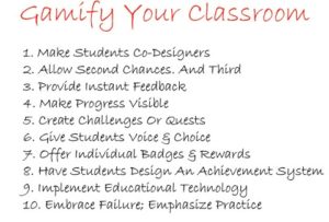
While the list above is incomplete and it may be an over-simplification. Take Badges, Points or Rewards, for example, these are important but some of the lesser useful elements of games.

For our purposes, gamification in this class about media ecology focuses on engagement, storytelling, visualization of characters, and problem-solving. It is the application of any of the immersive game-play mechanics, aesthetics, etc with the idea to immerse the learner and to motivate and engage him or her. Gamification is adding fun to the learning experience without trivializing it. In spite of what you may read elsewhere, gamification needs no actual game but it works by the learning experiences more engaging, by encouraging player/learner to engage in desired behaviors, by showing a path to mastery and promoting autonomy without being a distraction, and by taking advantage of humans’ psychological predisposition to playful learning.

A couple additional terms from gaming that we translate to the learning environment:

  • Modding – a game design term which refers to allowing the players to create mods or derivatives of the game. In this situation we are referring to the constructivist practice of providing opportunities for students to allow them to create their own quests (i.e., learning goals and contexts)and badges (i.e., thier own measures of success).
  • Removing the fear of failure – In gaming, failure is not a negative, but rather an opportunity to learn from mistakes and correct them. Set up mastery learning by allowing students to repeat without penalty until they have mastered the skill… require them to demonstrate skill acquisition before they move on to more difficult skills.
  • Reward mastery – by more than allowing them to move on but applaud interim mastery and success in some fashion.
  • Foster collaboration – Encourage learners to work together, a common practice of gamers who team up in order to achieve an epic win.

As you can see the immersive environment created by games and game like classroom settings is truly a different ecosystem than what we have seen in some of the others… and best of all it can be done in combination with any of other media types… from text to video to audio.. and to virtual reality. This is the intersection of media ecology studies and instructional design.

EME 6936/7608 {Media Ecology} – Final Deliverables

Wednesday, February 20th, 2019

Besides the individual assignments for this course that are due each cycle, there are three major activities that we are expecting according to the due dates posted on the Course Calendar.

  1. a course notebook that will contain two major sections:
    • Your comparison table of the media ecology pioneers as assigned in cycle two
    • a profile for each of three different media types (text, visual, immersive) that demonstrates your understanding each ecosystem that we are covering, beginning with the first cycle in which we introduce media ecology as an academic discipline. For each ‘section’ you will be provided a series of questions to answer. Based on the feedback given you can modify your artifacts and save the changes for when you turn in the full notebook on a single pdf file at the end of the term. Check the course calendar for the due dates.

  2. three separate story artifacts (also noted in the calendar). You are to create three versions of a story that is delivered/mediated using three different media types. The idea is for you to demonstrate how it is modified/affect by the different media using what you learned about the characteristics of each media’s profile as discussed/presented in each lesson module. You will present the story and provide a short narrative along with it that describes your rationale as to how you took advantage of/were limited by the media you chose. More on this when we meet in our first adobe connect session.
  3. periodic peer reviews of your classmates’ stories in terms of how you ascertain that he or she was able to demonstrate the use of that media form. At the end of the term you will write a short reflection from your peer reviews noting lesson learned from these reviews that you added to your own understanding from the lessons.

The collaborations/reviews are extremely important as its the notebook and will serve as your final reflections for this course. They will help me adjust the contents of the course to determine the relative value of integrating this course in a regular rotation.