GUI Bloopers: (2000) Morgan Kauffman and GUI Bloopers 2.0 (2007) by Jeff Johnson. http://www.gui-bloopers.com/

Before you begin, click the big circle to the left.
This lesson is a great segue to our lesson on content management systems. See note at bottom of page.
So, with the users in mind, let’s take a look at some quick and easy guidelines:
When building websites, it is common to get so excited about ‘being published” that one fails to look at the final design through the eyes of a new user/visitor. This is a case where we must ‘get outside of one’s self’ and not view things from o=your own eyes but that of others. This is harder to do than one might think. For example, when you enter a store, do you tend to go to the left or the right (or straight ahead)? Did you know the product placement on store shelves is an art (and one that product producers pay extra for)? Did you know that companies pay a grocers premium to have their products at ‘eye level’ or for ‘end cap’ space?
All of this is a part of visual arts and design. Retailers know this.. and good Web designers also pay a lot of attention. The rule of thumb is:
YOU ONLY HAVE 10 SECONDS TO MAKE A FIRST IMPRESSION.
Meaning that if you do not grab a visitor’s attention in this time frame, they tend to move on…
So with this in mind, let’s take a look at some very common bloopers.. these come from The book called
So, with the users in mind, let’s take a look at some quick and easy guidelines:
Some Common Bloopers
Some of the images shown here are a bit dated. But the concepts are universal and they are very representative of common mistakes still being made.
Click the images to increase their size to make easier viewing
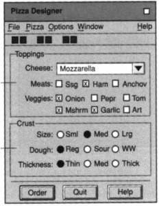
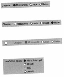
Mixing Radio Buttons and Check Boxes
Folks tend to try to be efficient by co-mingling check boxes (inferring that more than one choice can be made at a time) and radio buttons (only one at a time can be selected)..
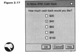
Here’s another example:
In this case a check box was offer for what the designer really intended a radio button.
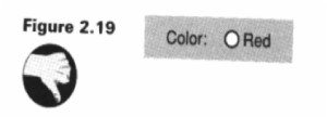
This one is silly as it is, often shows up
So, with the users in mind, let’s take a look at some quick and easy guidelines:
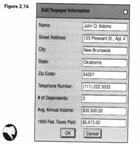
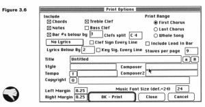
Diabolical dialog boxes
Can you figure this one out????
(a hint…. how do you know what choices to make and how???)
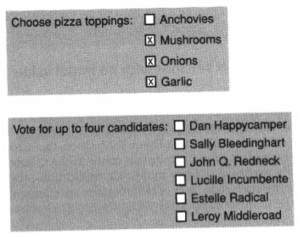
So I am not accused of simply bashing… here is an example of a pretty good set of choices:
Misuse of Text Fields
Text fields are often necessary .. but in order to manage efficiency AND consistency of data use drop downs when possible (note that is what we are doing with the easy Uploader function):
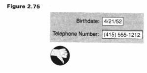
Seems like phone numbers and birth dates would be a ‘no brainer’, but how many times have you seen this?:
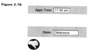
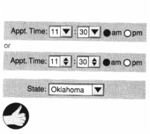
What about times and standard entries (like states)?:
Wouldn’t this be a better way to handle?:
Quirky Controls: A Review
- Check boxes that work like radio buttons
- Command buttons that function as check boxes
- Cancel buttons that do not cancel
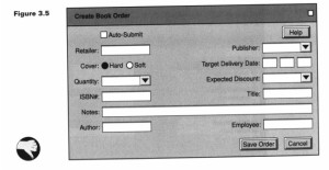
Incorrect order of entries (Presenting Information Poorly)
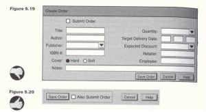
Even when you do use text fields be sure to provide commonality on entry fields and their layouts:
This one isn’t much better:
So, let’s review:
- Text fields should only be used for data that is really unstructured.
- Use alternatives (like drop downs) for specifying highly structured data values (for consistency.. recall that you may eventually want to make queries against this data)
So, maybe this one is better:
Design Rules for Layout Order
- Dominant Reading Order
- Frequency of Use
- Relationship to other Controls
- User Expectations
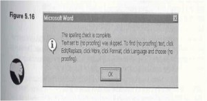
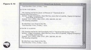
What about Error Messages?
I wonder if you can easily figure what the message is here:
Or this:
Miscellaneous Common Errors
- Sites that are slow downloading.
- Sites that are distracting by their use of gratuitous animations.
- Sites that can only be viewed with the most recent browsers and/or esoteric plug-ins (recall lesson on Web Standards).
- Sites that require users to scroll down or across to see important content (most important information needs to shown on opening screen).
- Sites that format text in fixed-width or proportional width block rather than letting the width of user’s browser windows determine the width of the text.
- Text that is too tiny.
- Back button abuse (I mean yahoo mail is the worst!!!.. you hit the back button and it takes you completely out of mail).
Now that we have gotten through design issues and learned a bit about poor design, let’s see if you are now ready to tell the difference. On the Web Pages that Suck site, pick out five and describe in your own words why you think they are examples of bad design.
In the Open Drop Box (i.e., others can see your entries) on Canvas and describe in a few sentences your impressions of the sites and how you would rate each one: 1-5 (1 being poorly designed 5 = top quality). yes, a bit subjective but it will be interesting to compare notes.. Once you are done go ahead an take peek at your classmate’s selections (no cheating). You are on your honor here.
FINAL NOTE
Content management systems generally do a great job in helping you make better design decisions. In some cases you can’t make a bad decision. Things like polls and voting booths for example, allow you to co-mingle check boxes and radio buttons but it can be difficult to do this, even on an open-ended plug-in like these. You still can choose wrong types of boxes. We have gone through several steps to get you to this point with the hope that you have a better appreciation as to why we use CMS systems (for both design and content), and how you need to have some knowledge about html, php, css, scripting, etc. You need to have a basic knowledge at least as to what role they all play so you can become a better site manager.
