Answer the following reflection questions and submit your responses in the Drop Box set up on Canvas. (three paragraphs … One paragraph each):
- Name and describe one or two ah-ha! moments you had during your explorations (something you did not know previously or something that you thought you knew but have changed your ideas).
- What does visual literacy have to do with teaching and learning? How do your new discoveries adjust/affect your building of a module on message design in instructional settings?
- Pay it forward… What would you tell someone about this topic if they were not able to attend class? (Pick out the main topics that they need to know and describe them as they relate to education/training)
[one_third]..[/one_third][one_third]
 [/one_third][one_third]…[/one_third]
This module is offered to bridge some of that content to the concepts of visual literacy, something that is quite relevant to this course. Our intent is to overlap but not duplicate the information. The intent of this lesson is not to lecture you about visual literacy or to provide you with all the answers about the subject. But to get full value out of this module it is expected that you will read what is printed here as well as click on the many links provided.
…and I do expect that this lesson will actually raise more questions… So:
Question #1:
Is that necessarily a bad idea?
Hopefully, not… The intent is to get you to begin thinking about instructional message design a bit differently and to understand how media affects communication and learning. A good place to start is with the term: symbolism.
To reiterate: WE ARE INTERESTED IN INTRODUCING THE CONCEPT OF VISUAL PERCEPTION and in particular VISUAL LITERACY
Below are a few concepts:
Stroop effect
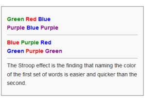
The Stroop effect is a demonstration of perceptual interference in the reaction of a task. When the name of a color (e.g., “blue,” “green,” or “red”) is printed in a color but spells out a different name (e.g., the word “red” is printed in blue ink instead of red ink), it has been found that naming the color of the word takes longer and is more prone to errors than when the color of the ink matches the name of the color. The effect is named after John Ridley Stroop who first published the effect in English in 1935. The effect had previously been published in Germany in 1929. The original paper has been one of the most cited papers in the history of experimental psychology, leading to more than 701 replications.
[one_third].[/one_third][one_third] [/one_third][one_third_last].[/one_third_last]
Here is a great site that explores this entire spectrum of visual perception.
Here are some of the major points to consider:
- Confronted by a visual image, humans generally separate out (extrapolate) a dominant shape (a ‘figure’ with a definite contour) from what is relegated to the ‘background’ (or ‘ground’).
- Gestalt psychologists outline what appears to be several fundamental and universal principles (sometimes even called ‘laws’) of perceptual organization. The main ones are (some of the terms vary among scholars): proximity, similarity, good continuation, closure, smallness, ‘surroundedness’, symmetry and ‘pragnanz’.
- Categorization is a key ‘top-down’ process in visual perception. The cost is a loss of particularity and uniqueness in perception and recall. For some, it is also regarded as inducing a sense of distance from the world. The way we categorize phenomena that we perceive is a ‘natural’ ‘reflection of reality’, leading us to forget the role of categorization in constructing our world.
- Perceiving things in a three dimensional plane is an artificial construct made up by certain learned ‘depth cues’. Linear perspective is only one kind of depth cue in a static two-dimensional image such as a painting, drawing or photograph. Relative size is another depth cue. Where an image features several objects of similar shape, the tendency is to assume that the smaller objects are further away. Height in field (or plane) is another cue to judging depth.
- Humans are driven by a desire to make meanings: above all, we are surely Homo significans – meaning-makers who make meaning through creation and interpretation of ‘signs’.
- Reading an image, is learned and is dependent on prior knowledge of possibilities; we can only recognize what we know.
A – Solomon’s ideas on Symbol Systems
Some questions raised:
- Within the definition of symbol systems as defined above, does text fit our definition of a ‘symbol system”?
- How can you be sure your words are being understood? What about the icons you may be using in text messages? are they UNIVERSALLY understood?
- What about fidelity (how true to reality — clarity, resolution).. how much of a role does it play in perception? Is 100% fidelity necessary?
Some more….
- What is the effect of using highlighting in text passages or on PowerPoint presentations to focus attention?. How else can we focus attention in text-based communications? Can these sometimes get in the way, especially by those who are literate in the topics?
B – Highlighting Textbooks.. a help or a hindrance?
C – Highlighting Hyperlinks on Websites
Here is another discussion on the effect of highlighting hyperlinks on Web pages
10 Usability Tips on focusing attention
So What, then, is Visual Literacy?
Now that we have explored what visual language is, we need to gain an understanding about the concept of visual literacy.
Wikipedia is actually a great place to start:
Of course an organization called the International Visual Literacy Association (IVLA) must be a place to find a good definition, no?
One last place to stop is the AT&T Learning Network